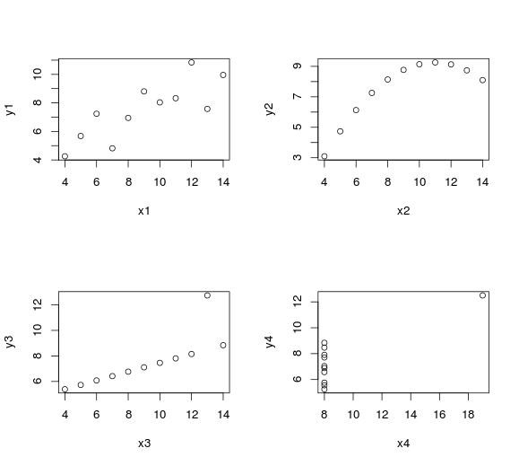
After reading about the Anscombe’s quartet, I felt like playing around with R. Using the datasets package, it actually takes just a few seconds to check that the traditional statistical properties of the four datasets are quite similar:
> # Mean
> colMeans(anscombe)
 x1 x2 x3 x4 y1 y2 y3 y4
9.000000 9.000000 9.000000 9.000000 7.500909 7.500909 7.500000 7.500909
>
> # Correlation
> cor(anscombe$x1, anscombe$y1)
[1] 0.8164205
> cor(anscombe$x2, anscombe$y2)
[1] 0.8162365
> cor(anscombe$x3, anscombe$y3)
[1] 0.8162867
> cor(anscombe$x4, anscombe$y4)
[1] 0.8165214
>
> # Variance
> var(anscombe$x1)
[1] 11
> var(anscombe$x2)
[1] 11
> var(anscombe$x3)
[1] 11
> var(anscombe$x4)
[1] 11
>
> var(anscombe$y1)
[1] 4.127269
> var(anscombe$y2)
[1] 4.127629
> var(anscombe$y3)
[1] 4.12262
> var(anscombe$y4)
[1] 4.123249
>
> # Simple linear regression
> lsfit(anscombe$x1, anscombe$y1)$coefficients
Intercept X
3.0000909 0.5000909
> lsfit(anscombe$x2, anscombe$y2)$coefficients
Intercept X
 3.000909 0.500000
> lsfit(anscombe$x3, anscombe$y3)$coefficients
Intercept X
3.0024545 0.4997273
> lsfit(anscombe$x4, anscombe$y3)$coefficients
Intercept X
 9.399 -0.211
The datasets, however, don’t look similar when we graph them and we can clearly identify the outliers.
par(mfrow=c(2,2))
plot(anscombe$x1, anscombe$y1, xlab="x1", ylab="y1")
plot(anscombe$x2, anscombe$y2, xlab="x2", ylab="y2")
plot(anscombe$x3, anscombe$y3, xlab="x3", ylab="y3")
plot(anscombe$x4, anscombe$y4, xlab="x4", ylab="y4")
What is the takeaway message from that? We should appreciate the value of data visualization and deep analytics.


